A Trinity Renovation With Artistic Vision: The Bathroom — Part 2 in a Series


In planning the design, we created drawings that considered each elevation of the room at an extreme level of detail. Because we were working with older dimensional lumber sizes, we were challenged to square up and level the room to accommodate the tile and other finishes. Framing this bathroom required highly skilled carpentry craftsmanship, using individually ripped pieces of framing material, in both metal and wood of varying dimensions, and correcting compromised floor joists. Our solution allowed for dedicated space for HVAC ducting, an AC line set, a powerful vent fan ducted to the exterior, and other mechanicals — with enough space left over to gain a few inches in either direction.
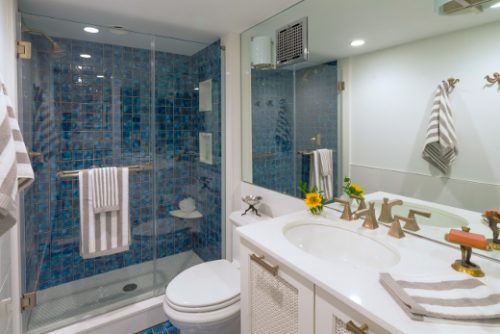
The concept for the bathroom design was “reflecting water.” We incorporated beautiful mottled blue tile to provide texture and patterns that blend naturally with the crafted overall concept for the house. Custom glass and mirror add reflection, bounce light, and keep the room feeling open. The space now feels clean and welcoming and functions larger than it is.
Other Noteworthy Features
- A custom vanity features a recessed toilet paper holder and full-size under-counter sink offset to create a large counter space
- Two pull-out drawers provide access to an internal outlet that allows a hairdryer to stay in the drawer, plugged in, ready to use
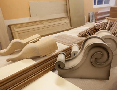
- A custom-cut wooden screen is used in the door panels, repeating the Moroccan screen motif found elsewhere in the house
- A crisp white quartz base, shower niche, and curb add to the floating water quality
- Large-format white tiles used for wainscoting add texture, while making the room easy to clean at the same time
About This Home
Our client purchased this pied-à-terre to create a unique second home that she could retreat to in the city. While located in a very walkable area — close to cultural activities, restaurants, and shopping — it is tucked away inside a shared courtyard with no street access and no legal parking adjacent to the site. The project was a true design build renovation that required extensive planning, with final drawing sets running well over 40 pages. We had regular meetings with our client and the decorator to collaborate on the details to make the finished space appear seamless. The result is a blend of our client’s vision, the decorator’s masterful use of color and texture, and our company’s design and construction experience, expertise, and background in fine arts. We were honored to be the team to execute this complex and unique job.
View the slideshow for this bathroom. To learn more about the project, view the kitchen slideshow.


